Sejà Restaurant
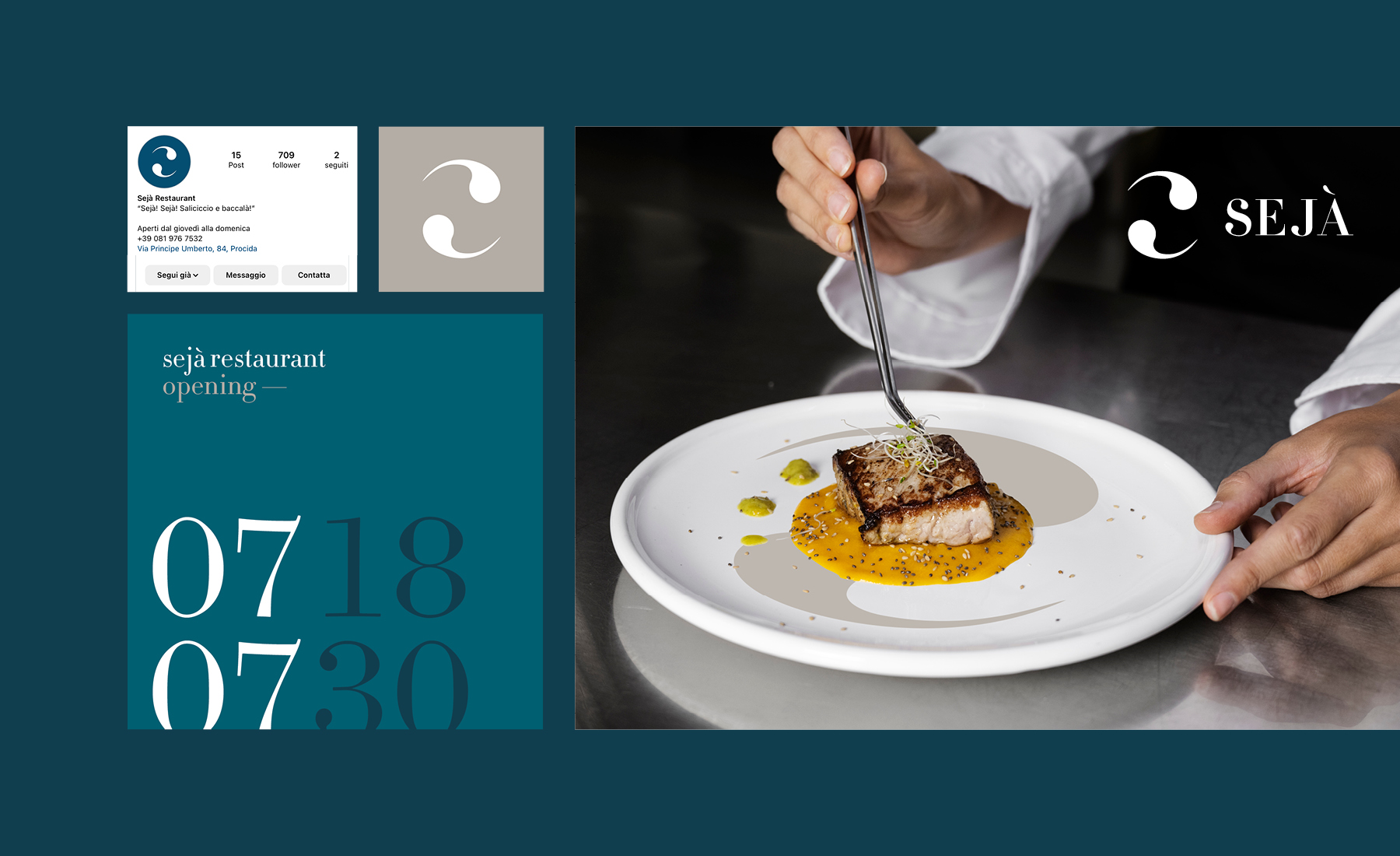
The ingredients of the typical Procida cuisine meet the creativity of chef Aniello: this is Sejà, a contemporary and modern restaurant in which unique and unrepeatable creations are made. The branding project reflects its innovative ed eccentric philosophy.
Discipline
Brand Identity
Sector
Food & Drink
Info
Procida, 2023
About
Sejà is the culinary concept of Aniello La Muro, a young chef who worked in important and starred kitchens between London, Antwerp and Copenhagen. Aniello’s idea is bringing northern european modernity and creativity in cuisine to an island where all the raw materials are at hand. The result is a restaurant that is creative but respectful of traditions, in a modern and essential place where taste is the dominant sense.


Rationale
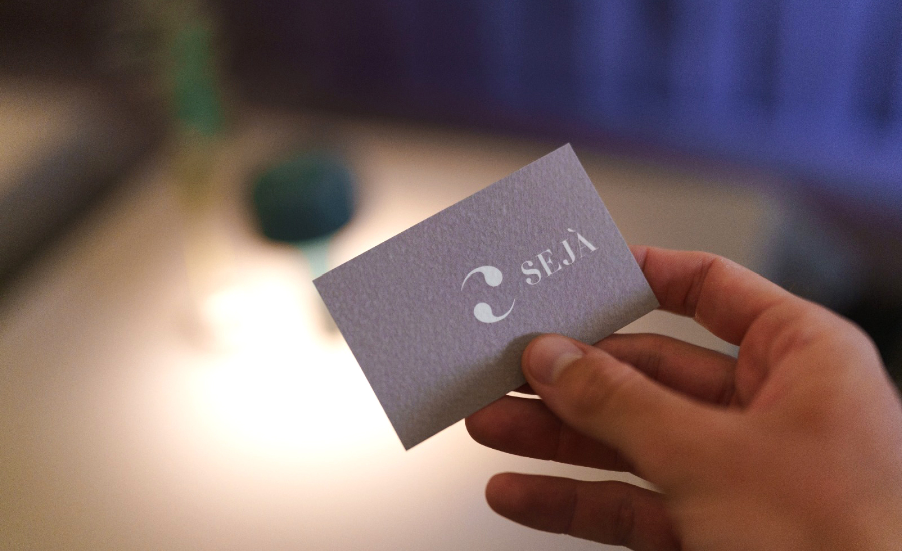
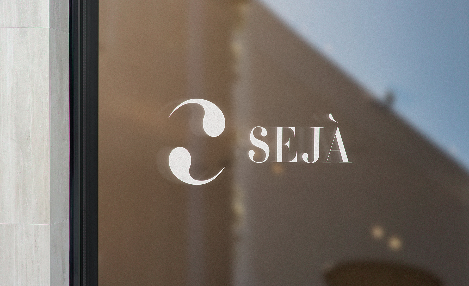
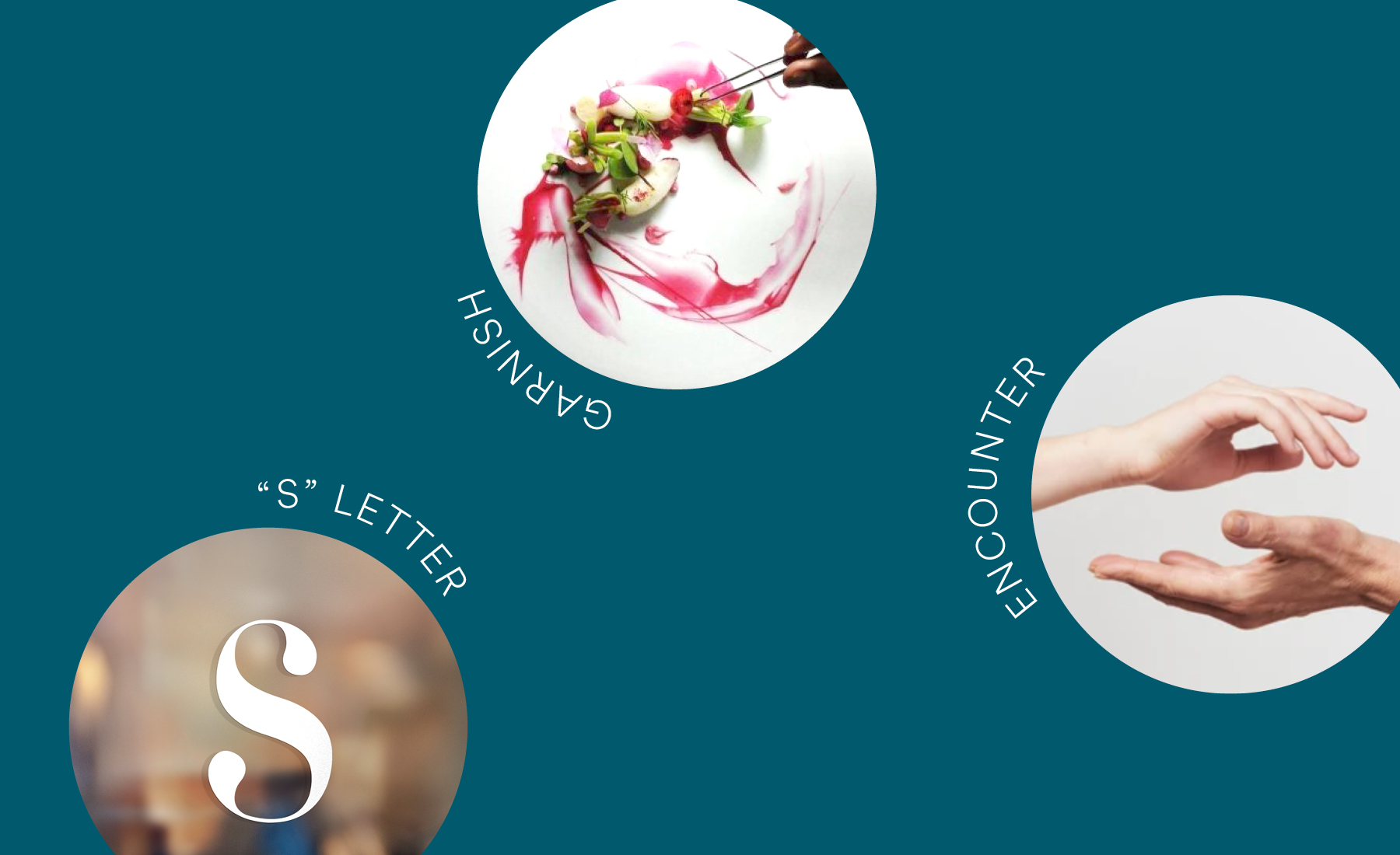
My first aim was give the client a strong and powerful symbol which was well-balanced, precise and dynamic. To achieve this goal I worked through the graphic synthesis of the letter “S”. The central part of the letter was removed and the letter is transformed into a symbol that has a strong centripetal force. In this symbol, that tends to abstraction, is possible to find different meanings: the yin yang, the encounter between tradition and creativity, the circularity of the dish.

Results
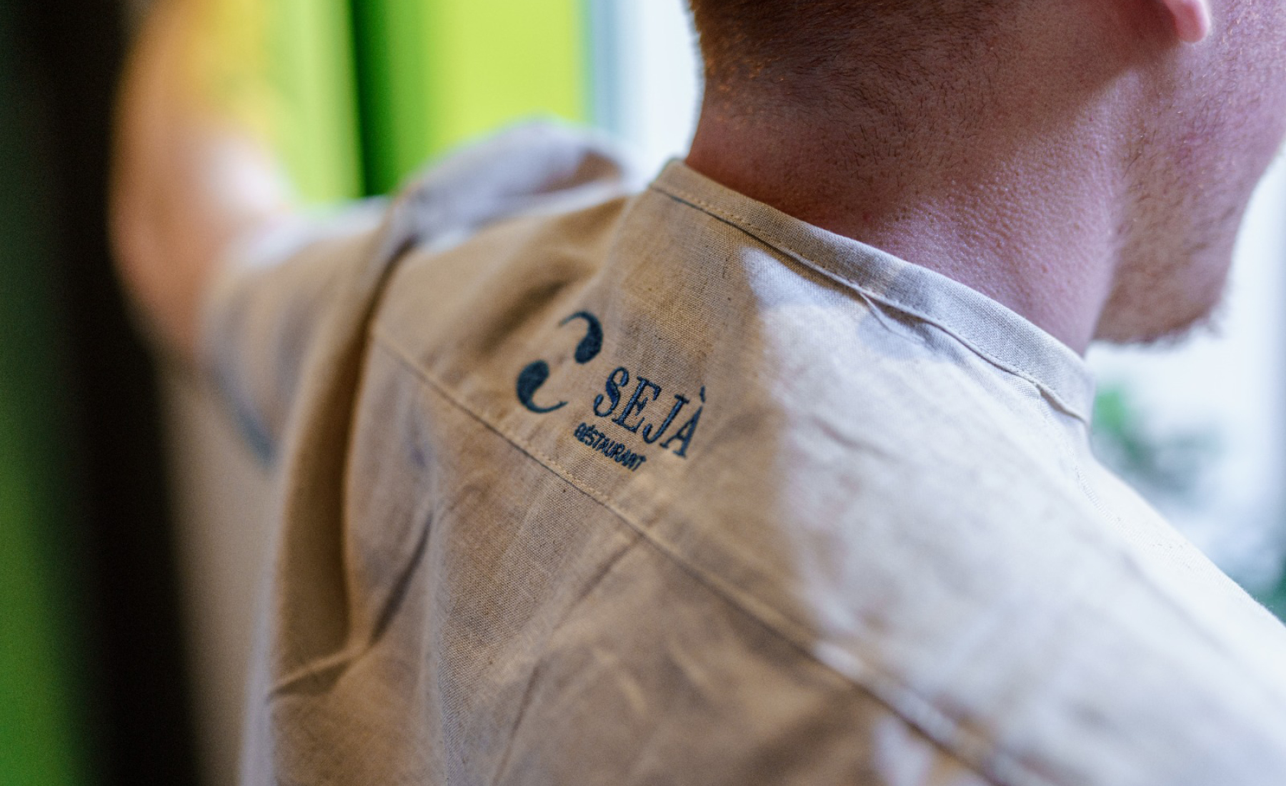
The final result is a logo that concentrates its strength in the tension of a circle. This makes the logo dynamic but minimal and extremely conceptual. Sejà's visual identity is tailor-made like a uniform: the elegance of shapes reflects the concept of its cuisine and is dynamic as its unique dishes created through knowledge and an unexpected combinations of ingredients.