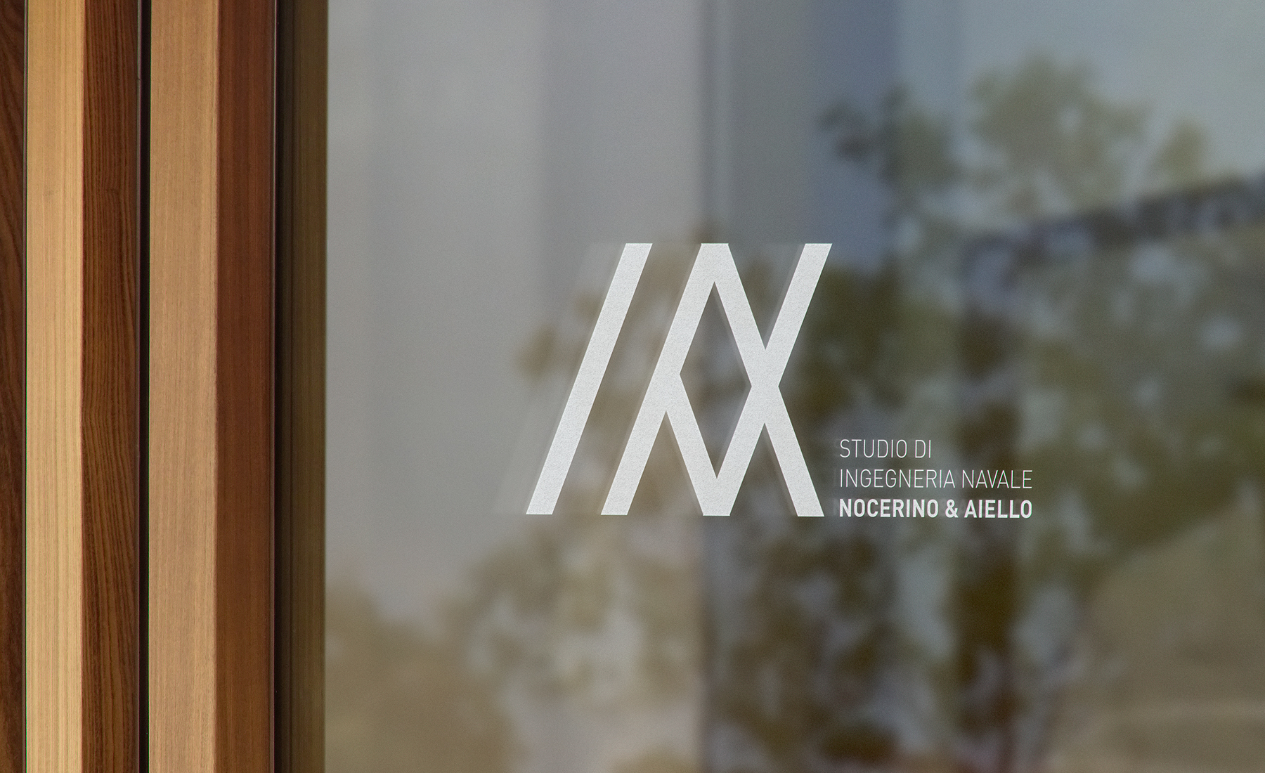
Studio Navale Nocerino Aiello
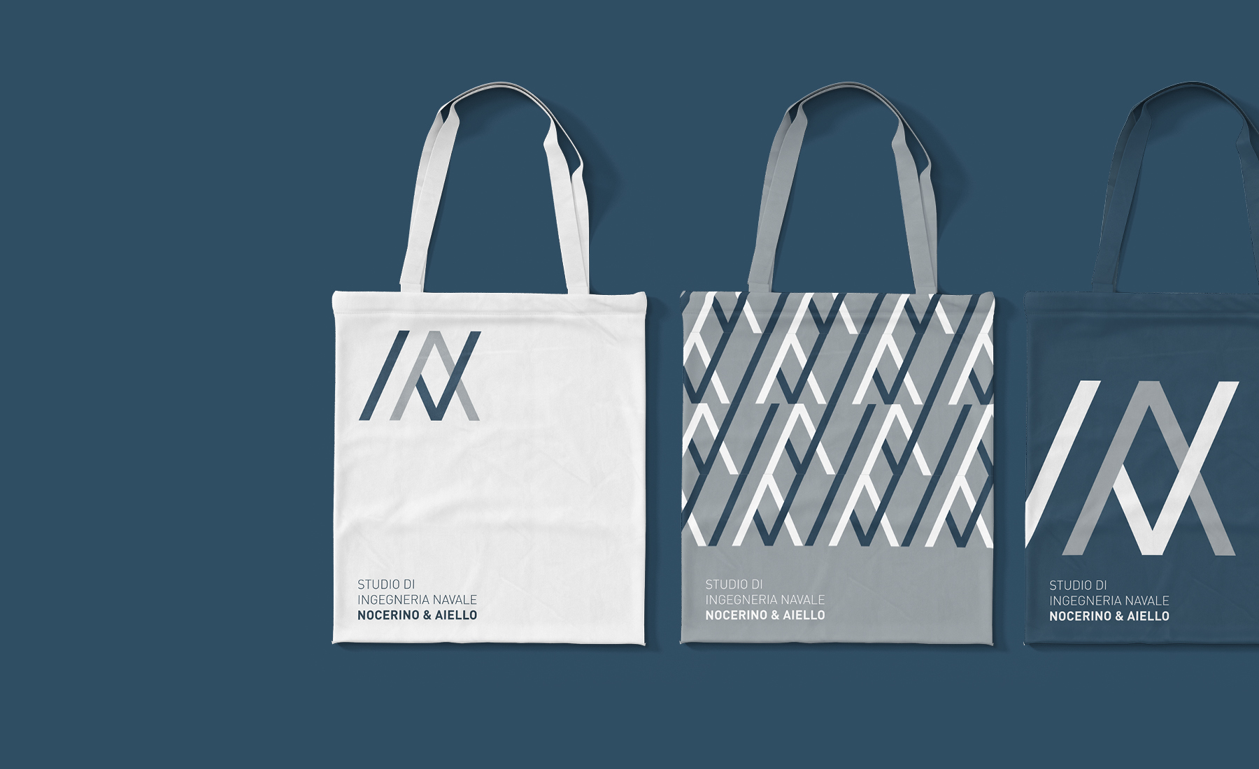
Five diagonal bands were all it took to design an entire brand identity system for a naval engineering studio. The monogram has been created specifically to talk to the studio's clients, in a technical and extremely clear way.
Discipline
Brand Identity
Sector
Professional services
Info
Italy, 2023


Brief · Analysis
A project born from a common passion which became a job. Studio Nocerino Aiello is the collaboration between two engineers who are gattered around one same methodic approach to work. After having carried out extensive research on the case study, the target has emerged as being made up by figures of the nautical sector (shipowners, boating business, shipyards). The communication that the studio needed is clear but with a modern and dynamic personality.


Rationale · Design
The starting point of the creative process was the intent to shape a brand identity according to the client’s request to recognize their initials in the pictogram. After designing a diagonal grid (tilted at 25 degree), I decided to work with essential shapes, in order to recreate letters in a simple way. Later, through removals and overlays, I designed the mixture of letters which gives three-dimensionality and dynamism to the monogram. The monogram use’s tradition is revisited in a modern and powerful way thanks to the use of diagonal. The color palette choice fell on three cold greys, two of them tending to blue, to maximize the logo’s technicality.
Output · Result
The studio's corporate identity turns out to be powerful and harmonious, but very technical in its essentiality. Tailor made for the company, it is perfectly calibrated for the client's target. The shape of the pictogram is suitable for a wide range of uses: it can be broken down (to create dynamic and enlivened textures) or maximized (by altering its relationship with the logotype). Asymmetrical placements e alignments reinforce the idea of redesign a traditional symbol (such as the monogram) in a modern way.


More Projects